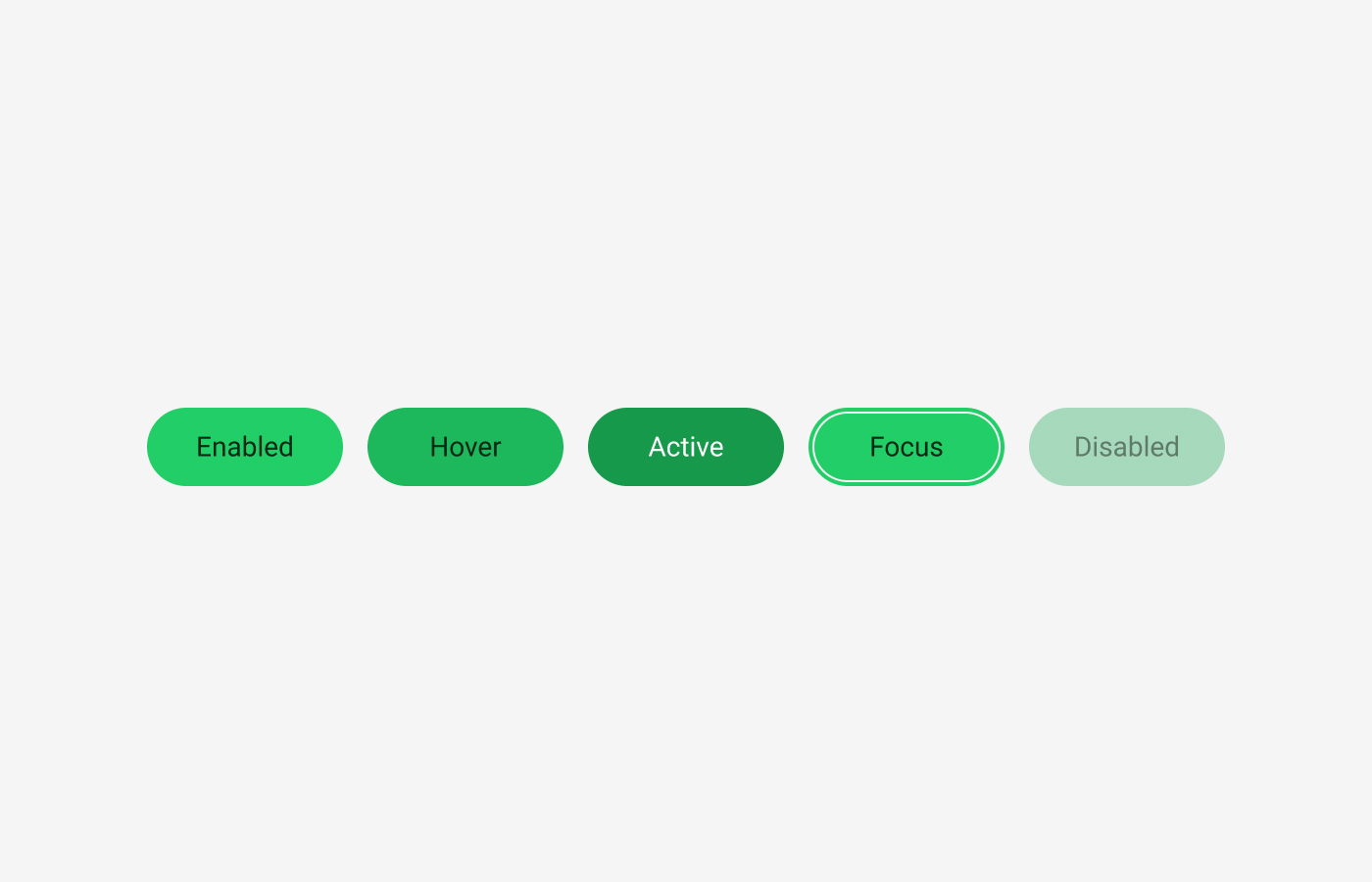
UX Design Principles

March 27, 2026
Why UX works the way it does
12 principles behind how users actually behave
Eugene,
UX/UI Designer

Users are less rational than we tend to assume.
They do not read every sentence on a screen from beginning to end, carefully compare every available option, or move through an interface in the exact order a designer intended. That is why UX is less about making screens look polished and more about understanding how people actually behave and designing experiences around those behaviours. From that perspective, the following twelve principles are some of the most fundamental patterns repeatedly observed in UX.
1. Users don’t read, they scan
People don’t carefully read text on the web or in apps. Instead, they quickly scan for cues and pick out only what seems relevant. Eye-tracking studies by Nielsen Norman Group show that users typically start at the top, move down along the left side, and selectively focus on words or phrases that catch their attention. The well-known F-pattern is a visual representation of this scanning behaviour.
This principle fundamentally changes how information should be presented. Rather than following the logic of long paragraphs, users rely on visual signals such as headings, subheadings, highlighted text, button labels, and list structures. As a result, good UX writing is not just about crafting well-written sentences, but about structuring content for scanning. The key is not only what you write, but what gets seen first.
This scanning behaviour is not a sign of laziness, but rather a rational response to an environment overloaded with information. Users are constantly trying to process as much as possible within limited time, so they naturally adapt by focusing only on what appears important. Therefore, UX should not aim to present all information with equal weight, but instead design for what users notice first and what they skip. This is why information structure often matters more than the content itself.
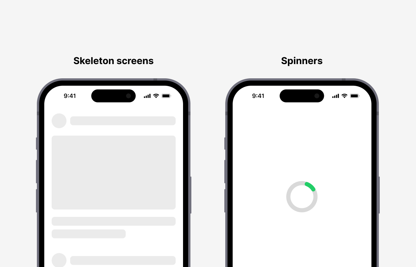
2. Perceived speed matters more than actual speed
Users do not measure how many seconds a system takes to complete a task. Instead, they judge speed based on how it feels while waiting—whether they feel anxious, whether something seems to be progressing, or whether it appears to be frozen. Nielsen Norman Group identifies 0.1 seconds, 1 second, and 10 seconds as key response thresholds, explaining that as delays increase, users quickly lose their sense of control and engagement.
For this reason, ux is not only about reducing loading time. This is also why skeleton screens are often preferred over spinners. A skeleton screen provides a structural preview, giving users the sense that something is actively being built, rather than leaving them waiting in an empty state. Research has shown that skeleton screens are perceived as faster and easier to navigate. In other words, having a fast system is important, but designing an experience that feels fast is just as important.
Perceived speed is not limited to loading states. It also includes interaction responsiveness, feedback after user actions, and the smoothness of transitions. For example, if there is even a 0.2-second delay with no visual response after clicking a button, users may feel that the system has stopped working. On the other hand, immediate feedback or subtle motion can make the same process feel significantly faster. Ultimately, in ux, speed is not just a technical metric—it is about the rhythm and flow that users experience.
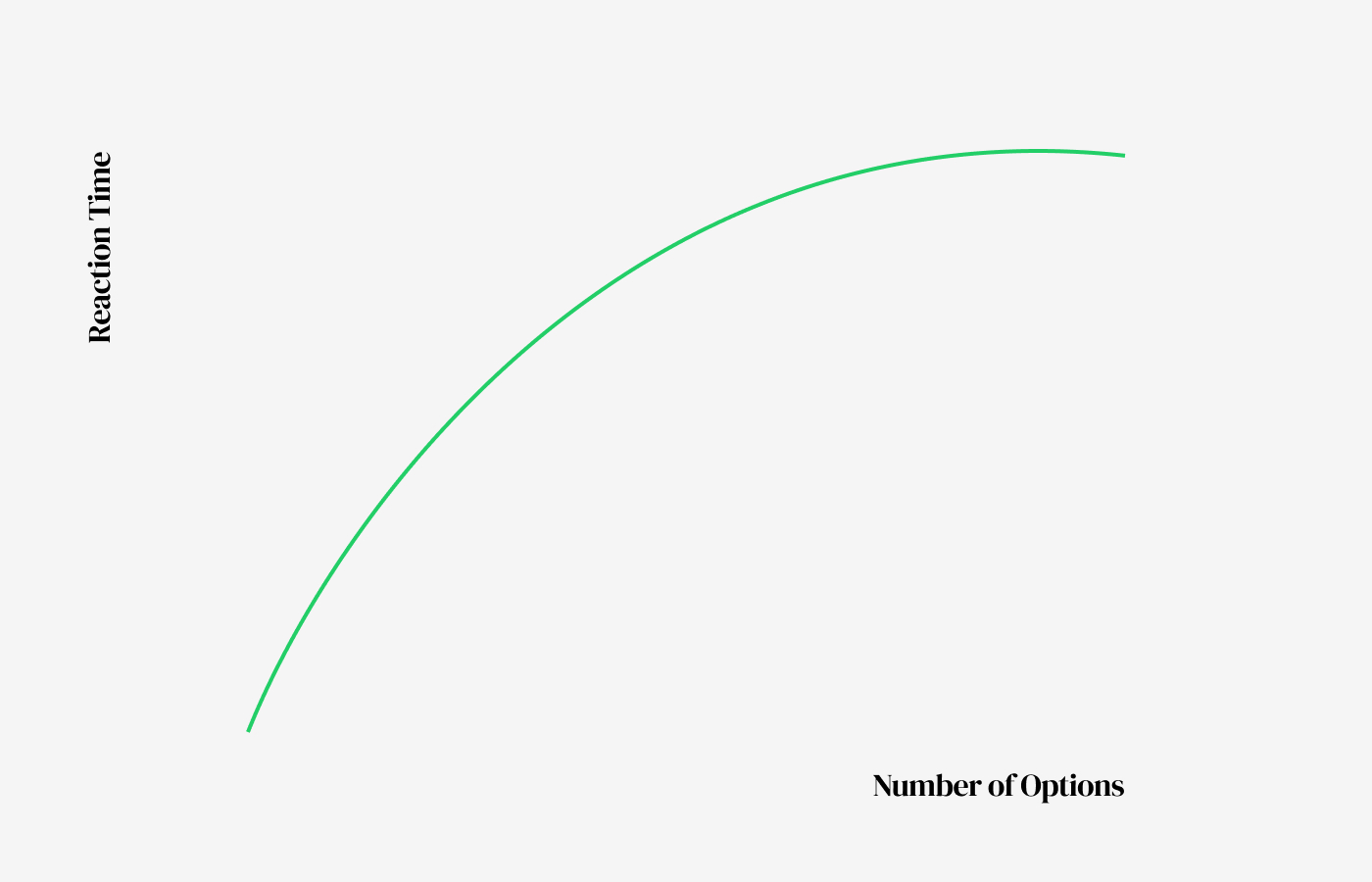
3. The more choices there are, the slower the decision
It may seem like giving users more options would lead to better decisions, but in many cases, the opposite is true. Hick’s Law explains that as the number of available choices increases, the time required to make a decision also increases. In other words, more options mean more information, and more information leads to greater cognitive load.
This principle applies to any screen where users need to compare and decide, such as subscription plans, filters, payment options, and navigation structures. The key is not simply to reduce the number of options, but to reduce the number of choices users have to process at once. This is why grouping, recommending options, or breaking decisions into steps can be effective. Good ux is not about offering many choices, but about showing the right number of choices at the right moment.
In situations with many options, the desire to make the “best” decision can itself become a burden. The process of comparing and evaluating every option creates fatigue. As a result, users may stop trying to find the optimal choice and instead pick what feels familiar or safe, or even delay the decision altogether. This is why ux should not only reduce the number of options, but also create an environment where users do not have to overthink. Elements like recommendations, default selections, and visual emphasis help reduce this cognitive burden.
4. Users don’t behave the way you expect
Designers often assume that users will follow a specific flow. In reality, users do not follow manuals. Don Norman explains that people do not try to understand the internal logic of a system; instead, they focus on finding a way to achieve their goal as quickly as possible. In other words, users do not learn the product’s logic—they work around it and adapt it to their own way.
For this reason, ux design should focus less on the intended flow and more on the flow users actually create. Some users start with search, others scroll, and some click images or titles before buttons. These differences should not be treated as errors, but as real behaviour patterns. The moment we accept this, ux becomes more grounded in reality. User flows are not fixed blueprints, but hypotheses that must be continuously refined through observation and validation.
This principle becomes especially clear in data analysis and user testing. The paths designers expect and the paths users actually take are often very different. Users do not choose the most logical route—they choose what feels familiar or what stands out visually. That is why ux design should rely less on assumptions like “this is how it should be used” and more on data that shows “this is how it is actually being used.” UX is not only about designing, but about continuously observing and refining.
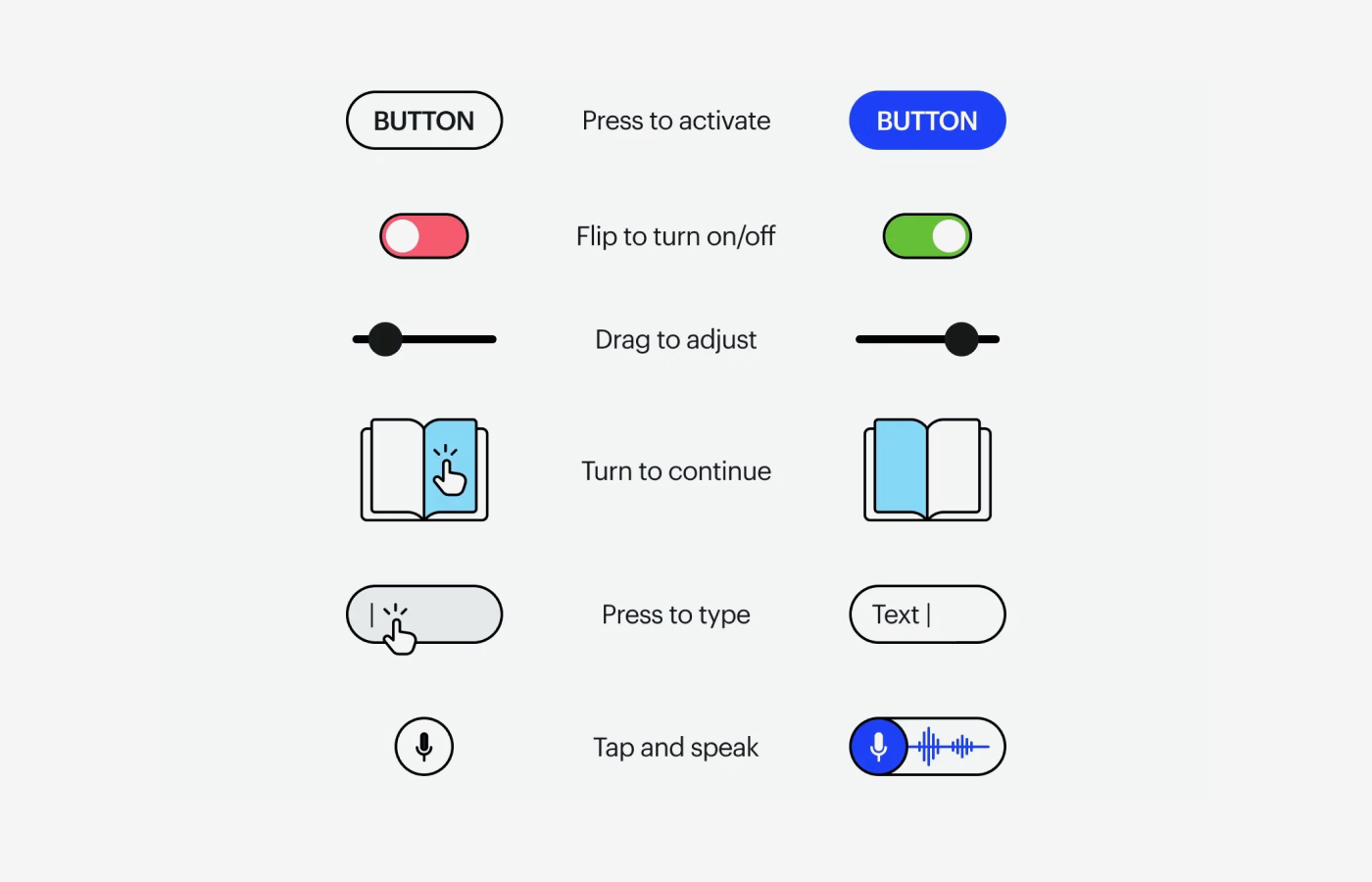
5. Interfaces guide, not explain
A good UI allows users to anticipate their next action without relying on lengthy explanations. Don Norman’s concepts of affordance and signifier help explain this. Whether an element can be clicked, dragged, or typed into should not exist only as a function, but should be revealed through its form and context.
For example, if a button does not look like a button, users may hesitate, unsure if it is interactive. On the other hand, when visual hierarchy, spacing, icons, and state changes are well designed, users can move forward naturally without needing instructions. The purpose of an interface is not to explain information, but to help users act without hesitation. A ux feels intuitive not because it is well explained, but because it barely needs explanation at all.
It is important to understand that intuition is never accidental. An intuitive UI is the result of deliberate design, built on users’ prior experiences, conventions, and visual patterns. Elements such as button shapes, shadow depth, colour contrast, and hover states all act as signals that communicate “this can be clicked.” In this sense, a good interface does not focus on making things easy to understand, but on making them usable without requiring understanding.
6. Visibility and clicks are not the same
Just because an element is highly visible does not mean users will click it. A CTA does not work simply because it has strong contrast or a large size. Nielsen Norman Group points out that generic labels like “Get Started” may attract clicks, but can also confuse users or interrupt their ability to find the information they actually need.
In other words, users respond less to what stands out and more to what is clearly meaningful. For a button to drive action, it must communicate what it does, why it matters at that moment, and what will happen after it is clicked. This makes CTA design not just a visual problem, but a behavioural one that involves copy, placement, context, and surrounding information. What matters more than a visible button is a clearly understood one.
Context is especially important. The same CTA can lead to very different outcomes depending on whether the user already has enough information or is still lacking context. A CTA should not exist as an isolated UI element, but as part of a larger flow shaped by the surrounding content. In the end, clicks are not the result of design alone, but the result of understanding and conviction.
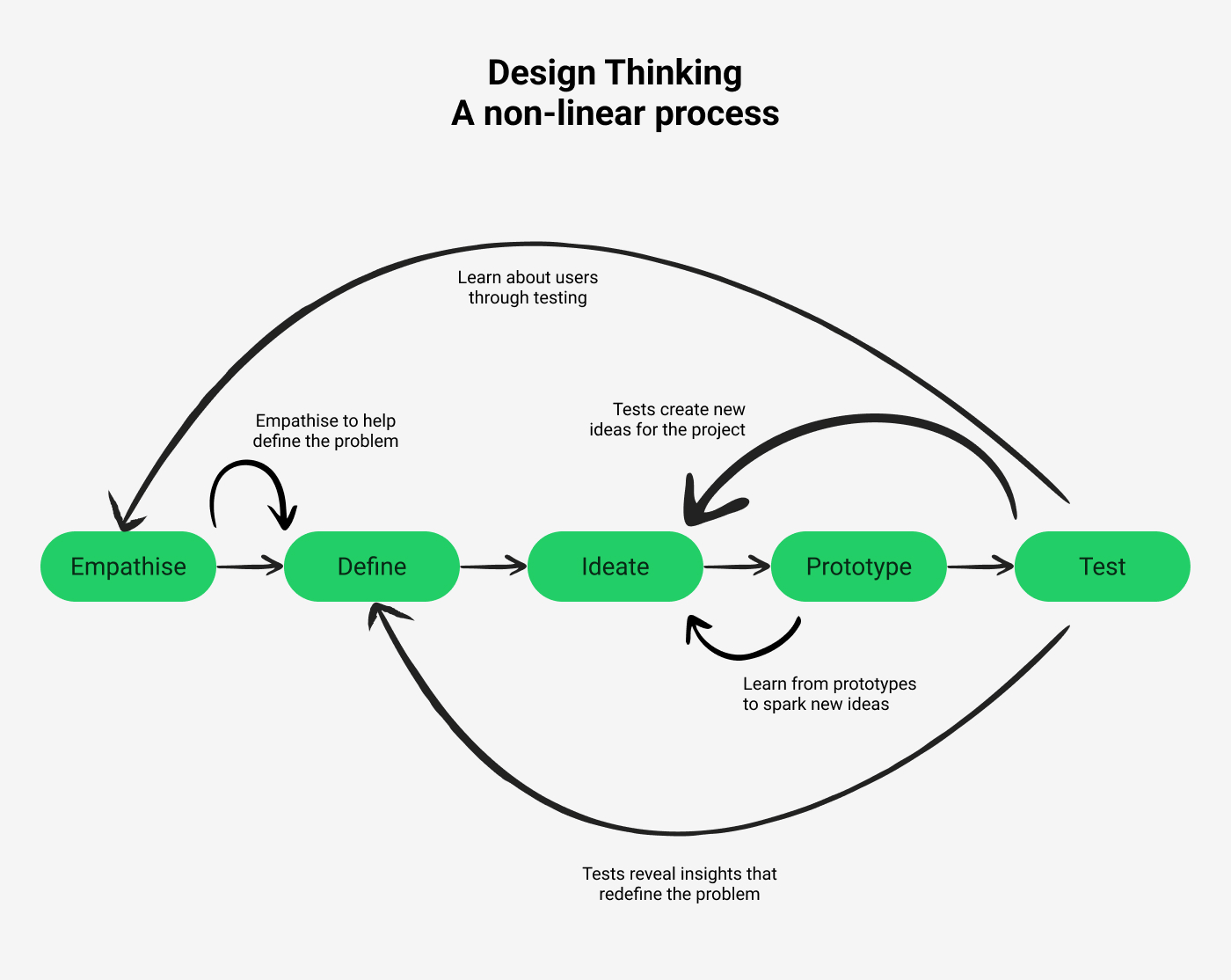
7. Problem definition determines UX
UX does not begin with polishing solutions, but with clearly identifying what needs to be solved in the first place. Stanford d.school emphasizes that the Define stage is about crafting meaningful and actionable problem statements. Similarly, IDEO frames design thinking as a human-centered problem-solving approach, stressing the importance of observation and interpretation before jumping into solutions.
This also means that adding features does not necessarily improve ux. What users struggle with is often not the absence of a button, but not knowing what to do next. In some cases, the issue is not a lack of information, but too much of it. When a problem is poorly defined, outputs may increase, but the experience does not improve. On the other hand, when the problem is clearly defined, even small changes can lead to significant improvements. In many cases, more than half of ux is already determined during the Define stage.
Another reason this stage is critical is that it sets the direction for everything that follows. If a problem is defined as a lack of features, more features will be added. If it is defined as a lack of clarity, the information structure will change. If it is defined as user anxiety, interactions and feedback will be reinforced. The same situation can lead to entirely different solutions depending on how it is interpreted. This is why ux is not just about design, but about how we frame and understand the problem itself.
8. UX breaks down in the details
Most services become frustrating not because of major features, but because of small points of friction. Ambiguous input formats, delayed error messages, or warnings that persist even after correction can all disrupt a user’s focus. The Baymard Institute recommends avoiding premature error messages, updating validation states immediately after correction, and providing positive feedback when inputs are correct.
Although these issues may seem minor, they make a significant difference in areas that require concentration, such as forms and checkout flows. Even experiencing a moment of “why isn’t this working?” once or twice can make the entire service feel exhausting. Good ux is not about dramatic innovation, but about removing these small obstacles to maintain a smooth flow. Details are not decorative finishing touches—they are what determine the overall quality of the experience.
These details become even more critical in repeated interactions. A small inconvenience may be tolerable once, but when the same issue occurs repeatedly, it leads to increasing frustration. For example, if a warning remains even after fixing an input error, or if the input format is unclear and requires multiple attempts, users experience unnecessary stress. UX is not defined by a single interaction, but by accumulated experiences. As small frictions build up, overall satisfaction drops rapidly.
9. UX writing drives behaviour
Text is not only a tool for delivering information, but also a mechanism for shaping behaviour. Button labels, error messages, empty states, and guidance copy all directly influence what users do next. Practical guidelines consistently emphasize clear and specific labels because word choice reduces the cognitive effort required to interpret an action.
For example, “Continue” is often more effective than “Confirm,” and “Pay now” is clearer than “Submit,” because they better communicate the outcome. Users read text to predict both the current system state and what will happen next. For this reason, ux writing is not just a subset of copywriting, but a core part of interaction design. A good sentence is not simply polite—it is one that removes hesitation and leads to action.
UX writing also has a strong impact on how users feel. The same situation can create different levels of anxiety, trust, or familiarity depending on how it is phrased. For instance, showing “An error occurred” versus “Please try again” creates a very different experience. Because users interact with interfaces as if they are in conversation with a system, text goes beyond information delivery and becomes a way of shaping the relationship between the user and the product.
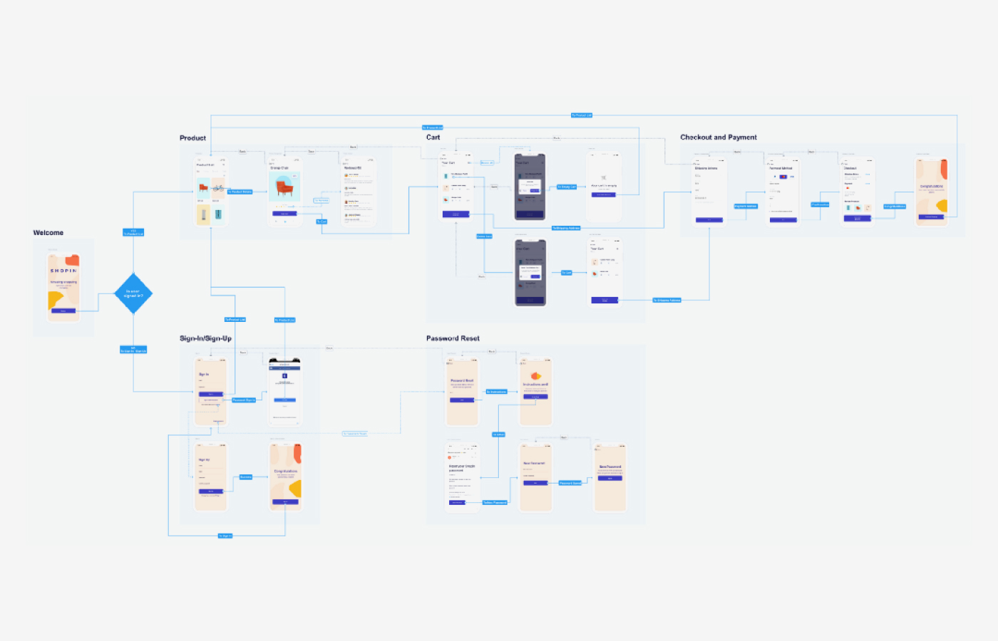
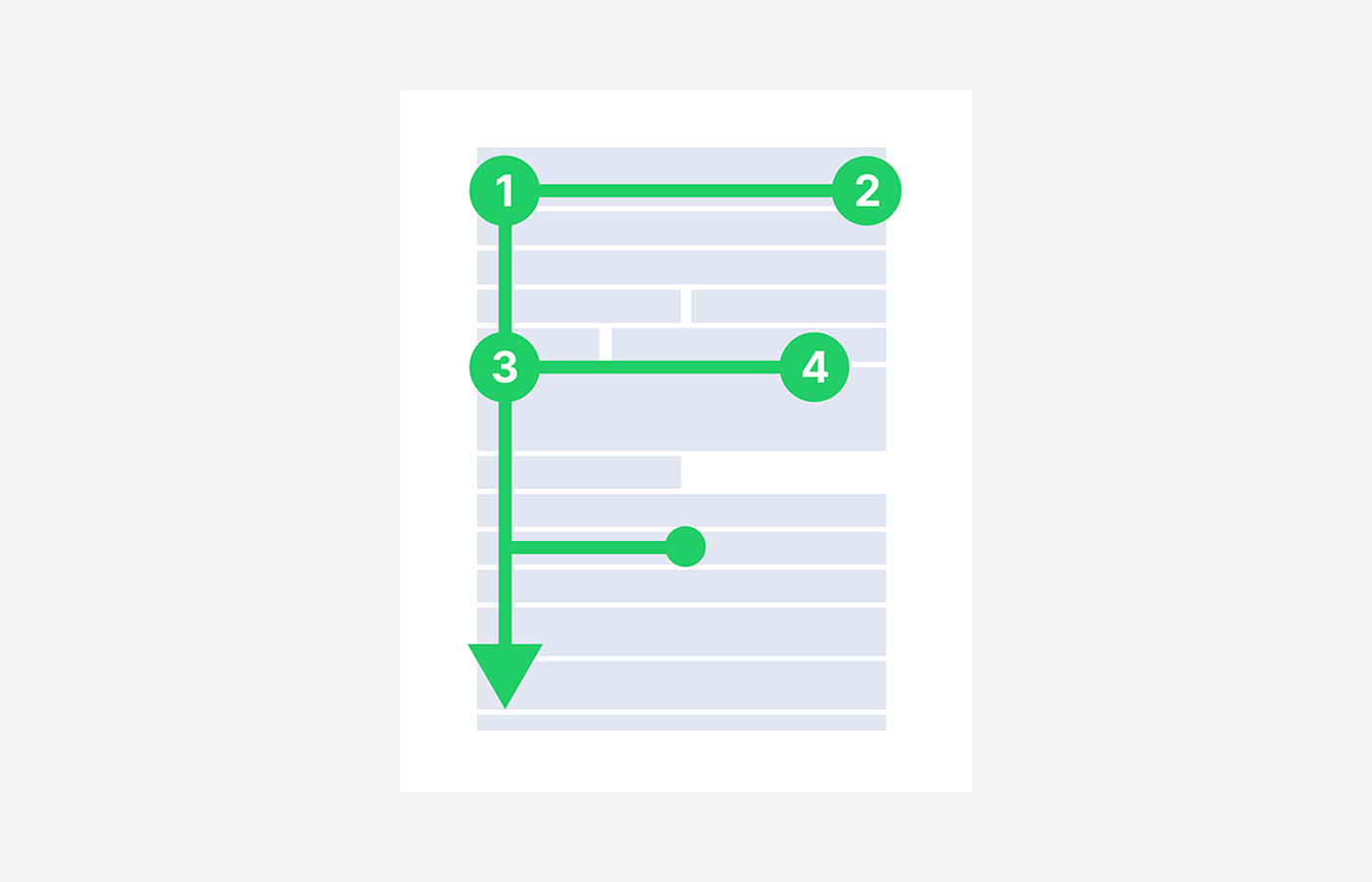
10. UX is not screens, but flow
Users do not experience a single screen in isolation—they experience the entire process of reaching a goal. Nielsen Norman Group describes both user journeys and user flows as tools centered around user goals, used to understand the structure of task completion rather than individual screens. In practice, experiences are remembered as flows, not as separate screens.
When this principle is overlooked, each screen may appear clean on its own, but the overall experience becomes fragmented. For example, sign-up may feel easy, but users get stuck during verification, or browsing may be smooth, but the information structure suddenly changes at checkout. Good ux is not just about optimizing individual screens, but about designing continuity so that users can reach their goals without interruption. In the end, what users remember is not a beautiful screen, but a seamless experience.
From this perspective, many ux problems occur not within a single screen, but in the transitions between them. When context is lost between steps, or when previous choices are not reflected in the next screen, users feel confused. That is why good ux focuses less on optimizing screens in isolation and more on designing connections that smoothly link one step to the next. When the flow remains uninterrupted, the experience feels simpler and more intuitive.