February 27, 2026
Inspiring colour combinations
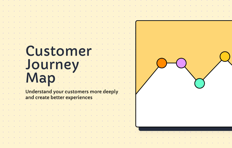
100 colour combinations to shape emotion and user experience

Eugene,
UX/UI Designer

In the world of UI design,
Colours play a vital role in shaping the user experience. By understanding how colours interact, you can create harmonious colour combinations that guide users, establish a clear hierarchy, and evoke specific emotions within an interface.
Read on to learn:
How to understand colour theory
Types of colour combinations
Colour combination examples
100 colour combinations to use in your next design
Understanding colour theory
Understanding colour theory is the key to creating impactful colour combinations in UI design. The tools below help create colour combinations with a specific purpose, evoke certain emotions, and improve the user experience.
Colour wheel
The colour wheel is the core of colour theory, organizing colours based on relationships. It includes three main colour types: primary (red, yellow, and blue), secondary (green, orange, and violet), and tertiary (a mix of primary and secondary colours). Colours naturally complement one another based on their position on the colour wheel.
Colour harmony
Colour harmony refers to how colours are arranged to create a visually pleasing design. It’s a technique that ensures colours in a palette work well together. A harmonious colour combination looks good and also:
Impacts the user experience by making designs more appealing and easier to navigate
Establishes visual hierarchy, guiding users’ attention to key elements and content
Contributes to brand recognition through consistent and complementary colour choices
Evokes a specific mood and tone, creating the desired emotional response from users
Ensures the accessibility of a design by adhering to colour contrast guidelines, making content readable for all users
Colour properties
Colour properties also play a significant role in colour theory and how users perceive and interact with colours. Experimenting with hues, value, saturation, and temperature can change a colour’s appearance and even wholly change its effects on the human brain.
For example, you can use the bold, attention-grabbing nature of the colour yellow to make essential UI elements stand out. But when you change its value and add a white tint to create pastel yellow, it softens the shade and brings a tranquil and fresh feeling to designs.
Colour psychology
Colour psychology explores the emotional and psychological associations with different colours. Colours and their many hues can influence a user’s mood, behaviour, and perception.
For instance, dark blue evokes a sense of tranquillity and reliability, and maroon has qualities that ignite feelings of confidence and stability. Referencing colour psychology when building colour combinations ensures you elicit the right response within designs.
Types of colour combinations
You can use many colour combinations to evoke emotions and create visually engaging designs. Some of the most common ones include:
Complementary. These colours are located on opposite ends of the colour wheel, creating a striking contrast when paired.
Monochromatic. These shades include a lighter or darker version of the base colour to create a consistent and subtle colour palette.
Analogous. These hues are closely related and sit next to each other on the colour wheel to create a natural colour scheme.
Triadic. This combination includes three colours equally distributed around the colour wheel, one used as the primary colour and the others as accent shades. These types of colour palettes create vibrant and eye-catching designs.
Tetradic. This colour combination includes four colours that form a square on the colour wheel and are equal distances apart. Tetradic colour schemes are more complex and tricky to balance, but create a vivid contrast.
Split complementary. This colour combination includes a base colour and the two colours on either side of its direct complementary colour on the colour wheel. This creates a vibrant yet balanced colour scheme.
Colour combination examples
Here are a few examples of tech companies strategically using colour palettes to evoke emotion and convey their core values.
Zoom

Zoom’s primary colour is blue, as seen in its logo and call-to-action (CTA) buttons throughout its website. Blue’s connection to trust and professionalism ties back to the security and reliability a user wants in a video communication platform. The use of white in its background and accents creates a sense of clarity, fostering ease of use within the platform.
Apple

Apple is known for its sleek and user-friendly tech products. The use of white, black, and space gray creates a premium aesthetic with a touch of sophistication and innovation. The clean light gray canvas of its website allows its products to take center stage, providing users with a visually pleasing experience.
Microsoft