
While preparing for the brand launching pop-up store, we had prepared a lot of things such as VMD, colour guide, visual object, packages, graphic etc. But we focused and talked about brand curating and product display in particular. (Images and texts weren’t organized yet) As we had to communicate brand experiences of online to offline, so brand curator had to deliver all brand informations to the customers. We thought every touchpoints where customers and brand meet creates an brand impressions, so not only product displays but curator’s words, behaviors and even clothes could affect brand impressions. So we prepared a pop-up store, starting with aligning brand curating guidline with the value that brand pursues.
Most of all, the definition of brand is ambiguous, such as brand essence, mission and core value. We had to get words and sentences that contain a clear definition of brand. In addition, images and visual materials that can show brand clearly and guidelines such as what to use, how to use and where to use. From these trivial definitions to specific guidelines, we need to create them clearly.
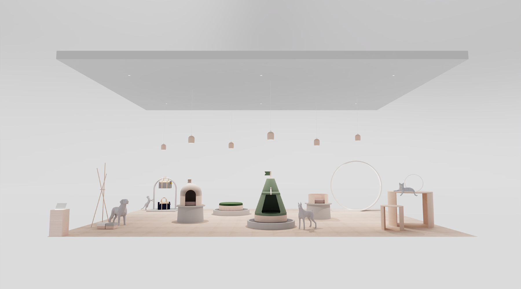
It is necessary to define solid and consistent design principles and to define a space identity that can show the brand identity in any other spaces. By using another brand that B&R has, it needs to show clearly brand essence and mission. While working at pop-up store, needs to get datas of customers such as behavior, emotion and any other react and apply to brand develop in the near future.
After looking back on brand, we thought it was necessary to make vague things to be clear. It was to make vague words commonly used by any other brands such as innovation and creativity into essential words and sentences for Berg & Ridge. If the definition is not clear and normal, customers may feel distant and there might be a lot of confusion in the future direciton of brand. Not simply saying, such as "Pets love our product", "brand for pets and human" or "we persist sustainability", but stating more clear words and sentences.
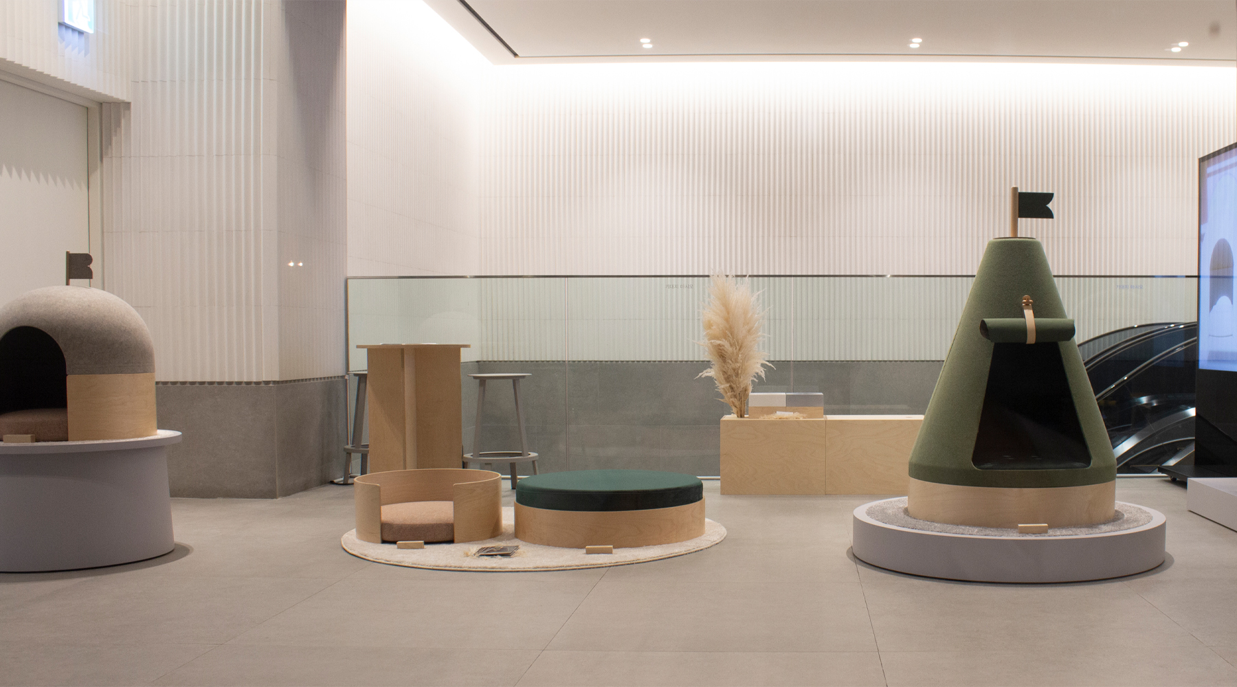
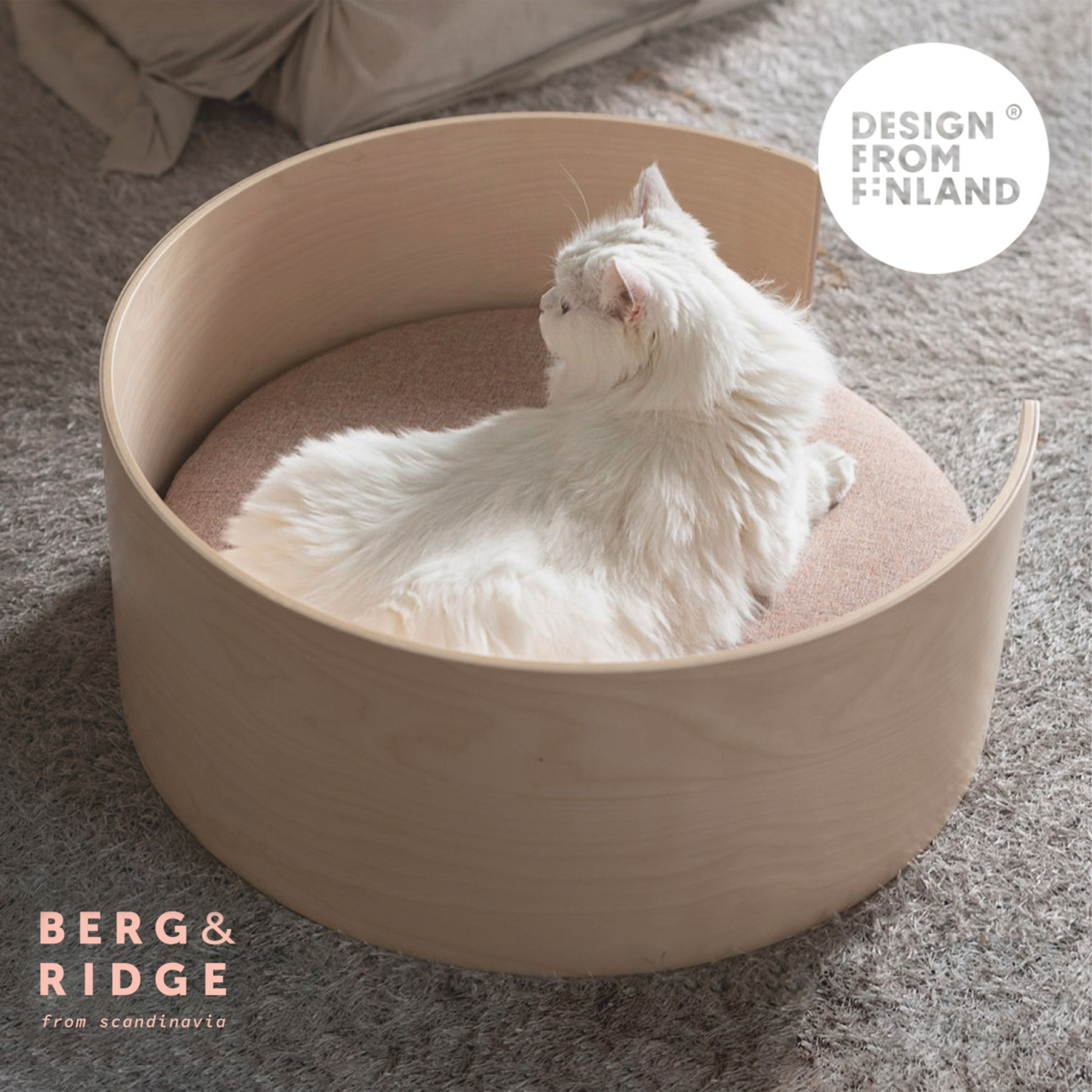
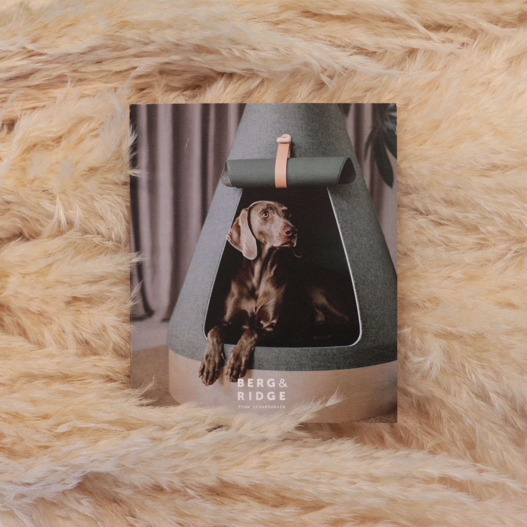
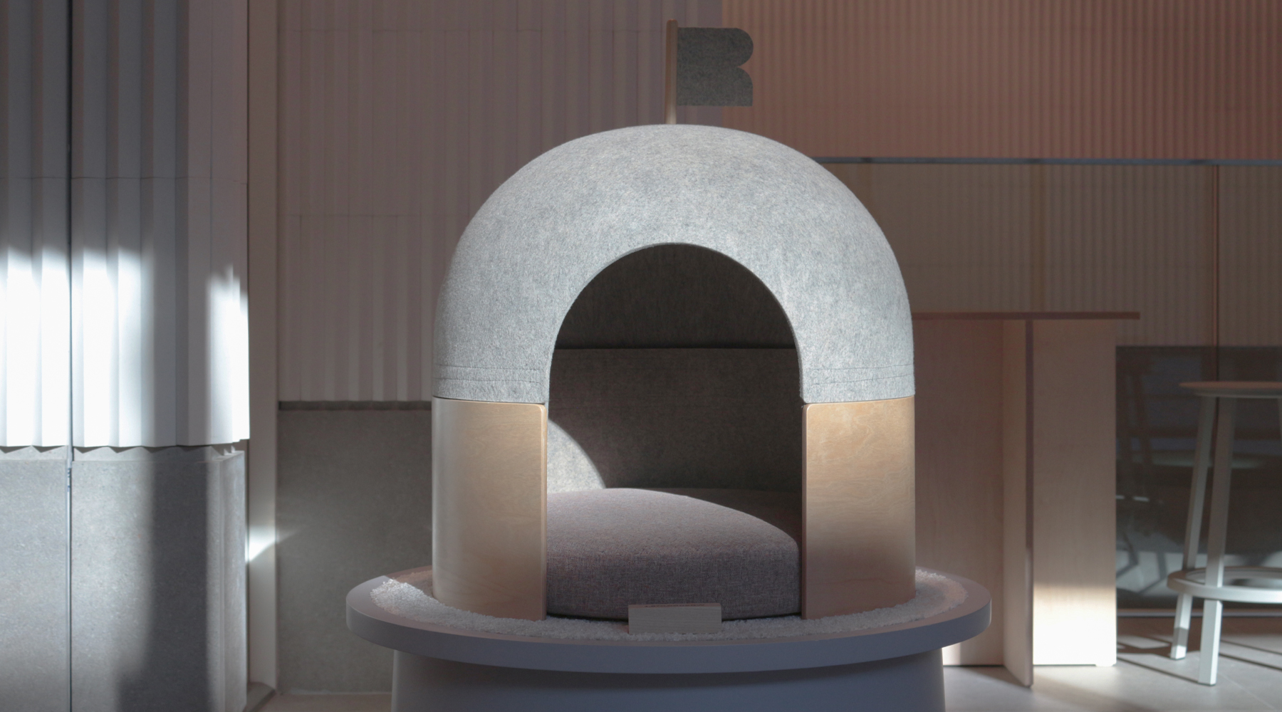
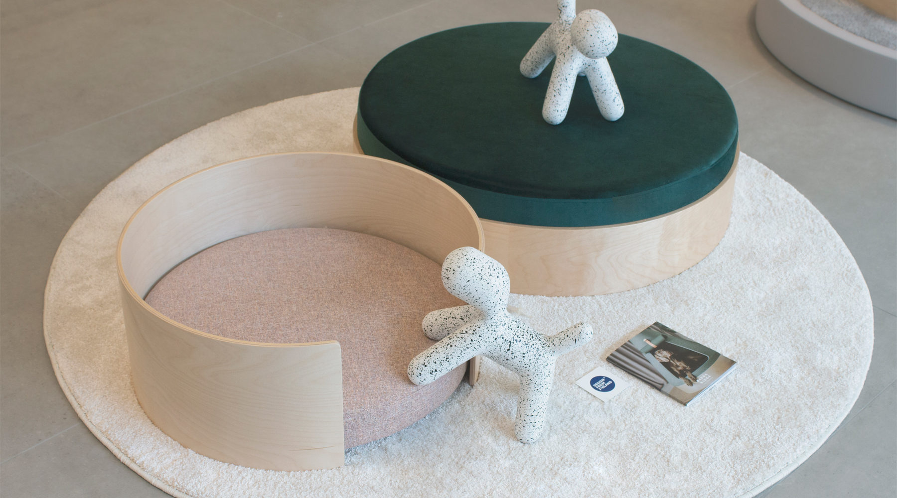
We made 4 design principles such as Brand for pets, Sustainable, Focusable and Accessible. We needed to deliver that Berg & Ridge is inspired by snow-covered Finnish Lapland where the dogs are runing, playing and rolling around in the snow. And we had to deliver sustainability of brand and design not only saying recyled materials and reusables one but considering products' lifecycle and communicate and deliver sustainability of resources and goods(money, time, etc.) to be used more valuefully. Also we had to made space where customers and pets can focus on brand space and products. Not to use unnecessary decor, designs and elements that interfere with immersing in brand. Above all, avoid unnecessary production. And the last thing, accessible, we will make environment where customers, most of all, pets experience space and products.
Brand's space identity had to be founded. In defined space identity, by bringing next space design to brand philosophy, we have to deliver customers with same brand experiences in any other spaces. At the first step, we looked around the assets that we already have. To accomplish brand mission, all assets and elements have to work harmoniously, make synergy and impacts.
While working as curator, we'd ifgured out that informations which customers really want are different from what we were going to deliver. They frequently asked price, materials, delivery period size rather than brand origin, history and sustainability. Since opening a pop-up store, we had written down and analyzed everything what customers said and did action, such as behavior type, age, impressions and actions etc. And we put that data together on a weekly basis and anlyzed their needs. That insights was applied to pop-up store space and webpage design later.
Article written about the brand
Estimated views of the brand
Distribution channel extension
Co-work & collaboration proposal
Total revenue