December 4, 2023
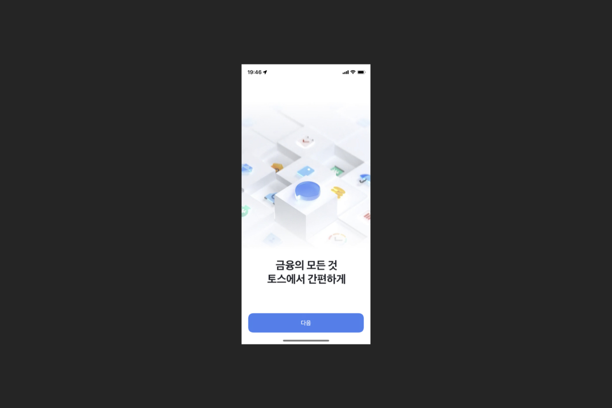
How to improve the process of sign-up from Toss Design Conference
A story without completion, from problem recognition to problem solving

Eugene,
UX/UI Designer

As the main age group subscribing to the service has changed, the sign-up completion rate dropped significantly. We take a detail look registration process one by one and think of the ways to increase the registration rate ultimately.
Problem recognition
The rate of sign-up rate is lower than expected. The main age group subscribing to the service has changed from 20-30s to senior users like 40-50s, and they became the main users to use service. But sign-up completion rate dropped due to the complicated registration process and they needed to improve that process.
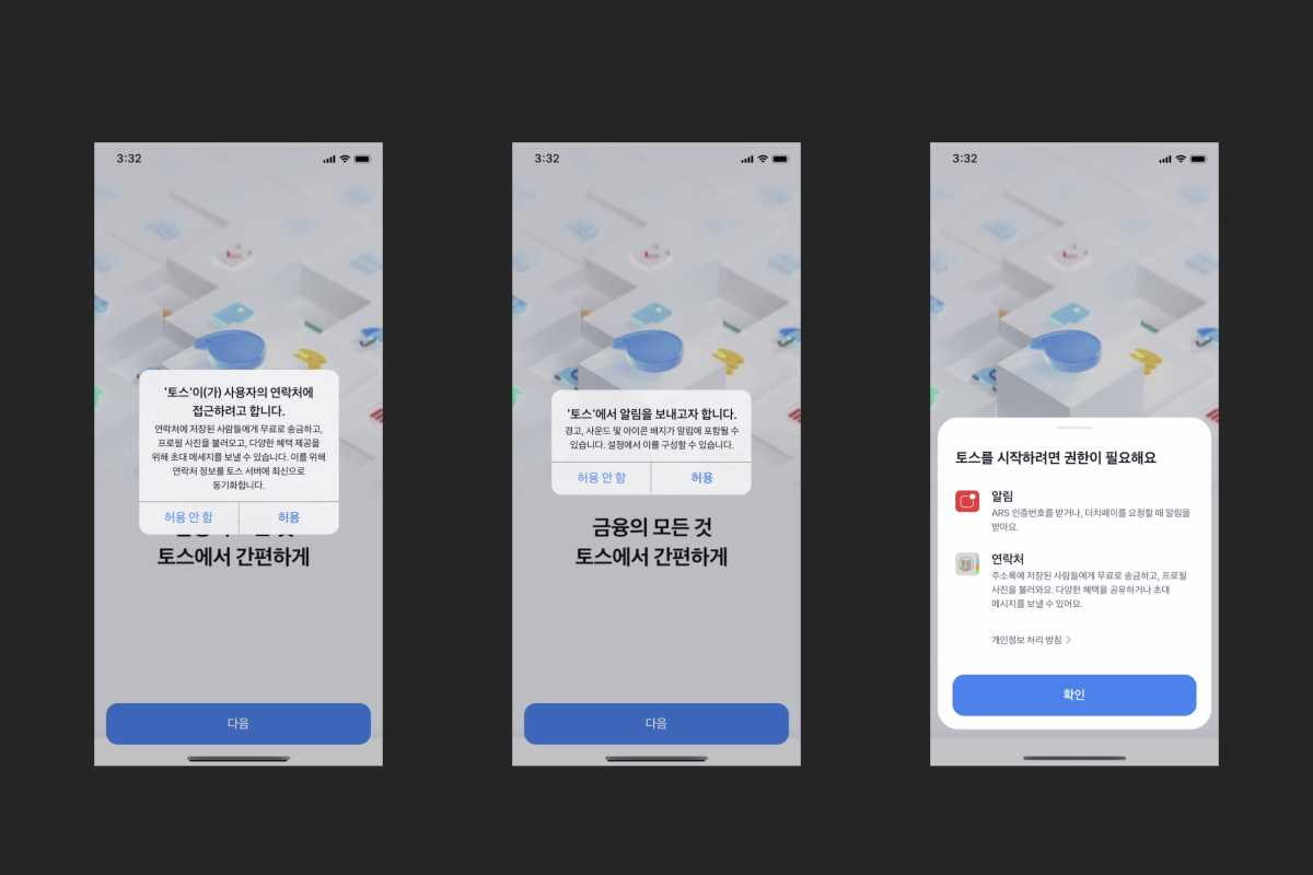
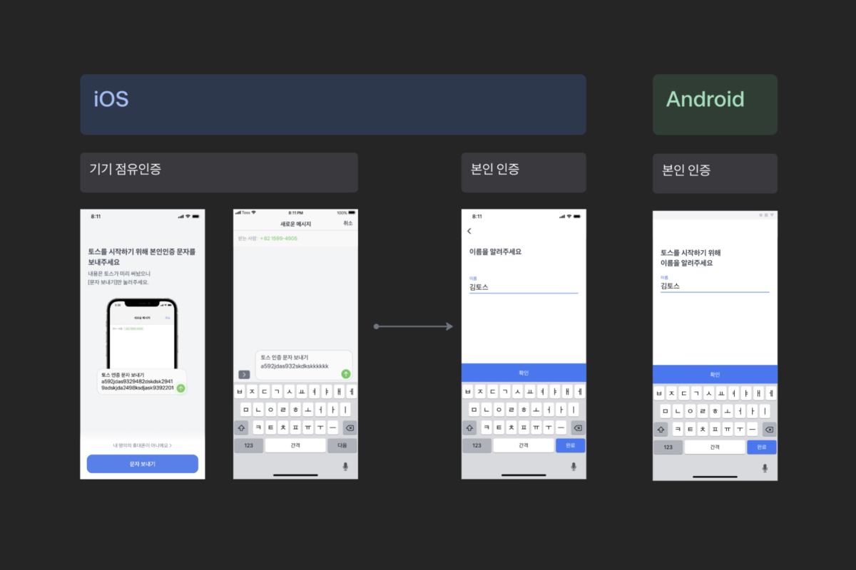
To register Toss, the registration flow is little bit different for Android and iOS but basically, you go through a complicated process. Among these requests, we first look at the permission granting steps that have a low pass rate and take a detail look what we can improve clearly.
First trial
Permissions granting
To install app, Android requests 4 system permissions and iOS does 2 system permissions. Users install the app and as soon as they run it, they encounter several unreadable system pop-ups. In case of this, users may have experienced the same process in other apps. This is because the service cannot be provided smoothly if users do not grant for service to allow the permissions. However users may think that it is not reasonable and “How do I know where these permissions will be used and do I give you permissions to do so?” But ridiculously, in case of Android, you cannot use the app unless you grant permissions.
Q: Then how did you approach?
At first, we thought about making users understand their permissions, but in the end, we decided to completely remove unnecessary permissions. There’s one like “why we didn’t get rid of it?” It was the “contact”. Now, you can transfer the money for free, but previously, to use that service for free, you had to send it through your contact. So, we were aiming to provide that service experience to more users, and made contact permission required.
But now, you can transfer money for free without any conditions. So we can receive that from only users who want to transfer money based on their contact information. As a result, we experimented with reducing the permissions for each OS to one permission.
Q: Has sign-up rate increased by reducing the number of permission granting steps?
No. There was no difference from before. For users who don’t have will to sign-up for a service, it is not matter whether they have one request or two-more requests.
Second trials
Q: Is there any another trials?
We decided to remove the rest of permissions as well. However, these two permissions, the one is to allow Toss to make and manage calls, and the other is to allow Toss to send notification have clear reason why these two should be obtained, unlike the contact information said before.
If you allow the permission of “manage call” in Android, it fills automatically in the text authentication number, and figure out when to hang up the call. So if you allow this permission, you can easily do sign-up. However if you don’t, you must go through all process of sign-up such as entering all information yourself in the registration process.
And iOS user had to allow the “notification”. In bank service, it is important for you to get notification such as deposit & withdrawal and payment alert. You can’t use Toss service properly with out notification. In Toss Design team, we thought this is more like a convenience than a requirement, but making people understand these things was not easy. So, “Let’s give up what we think is user convenience.” So we decided to remove all of these permissions in the process of sign-up.
Q: How was it?
Failed. In both of those OS, if we don’t get permissions, the conversion rate to the next screen is slightly higher, but there’s not significant difference in the end. But we were able to get new insights.
When we receive permission of “manage call” on Android, your information is automatically filled in. Then, the agreement rate for subsequent terms and conditions dropped down. However, if user filled their information themselves without auto-fill, the agreement rate for the terms and conditions was little bit higher. We thought “did auto-fill function reduce sunk cost and make it easier to give up?”
Every moment you go through sign-up process, there’re many moments where you have to read and type the text and focus, creating a continuous sunk cost of labor. However, if the information is easily filled automatically, the time and cost that user spends is reduced, so they feel that it is not a big deal to give up sign-up in the middle of process.
Third trials
Q: I don't think you guys ended your experiment here. What was next?
Right. It made us shocked that there were no significant results, but possibility to keep trying. Next trial was Intro. We thought ‘They already downloaded the app but why they didn’t touch ‘Next’ button?’ Is the sign-up process where the user’s will is weakest?’ Because there were literally “Nothing”. And It was difficult to see that Intro provides something meaningful value.
Also, there was review by a team, she didn’t any action until the end of Intro video. In fact, we thought this was a screen that cost more than we thought. So we decided to remove the Intro because app service introduction is already written in both the App Store and Google Play Store.
Q: Then you removed all permissions and introduction and asked their name first?
That's Right. But no meaningful results were found again. When the intro was removed, the completion rate of entering personal information decreased again, so the final conversion rate became the same as the group of users who viewed the intro. But through the above experiments, we’ve got foundation for the next experiment
In the previous experiments, we were not able to solve the problem which users eventually don’t complete sign-up process, and we didn’t know the reason why. However, what we learned from the previous experiments was no matter what attempts we did, the rate of sign-up process that users completed were not different. And the conversion rate for senior users who use large text is particularly low. So this time, we tried to improve the information input process itself.
Q: Were there any problems while filling personal information?
2 problems existed. First, the current screen didn’t provide an optimal user experience when the text is large(characters were cut off, etc.) and second, senior users were very reluctant to provide personal information. So, based on those issues, we thought we had to provide optimal display environment for people who are using large text, and make them sure to click the “Next” button to proceed next step. But it failed again. There was no meaningful results, but we figured out that there were no problems with the process of filling personal information itself. So we thoguht of next experiment.
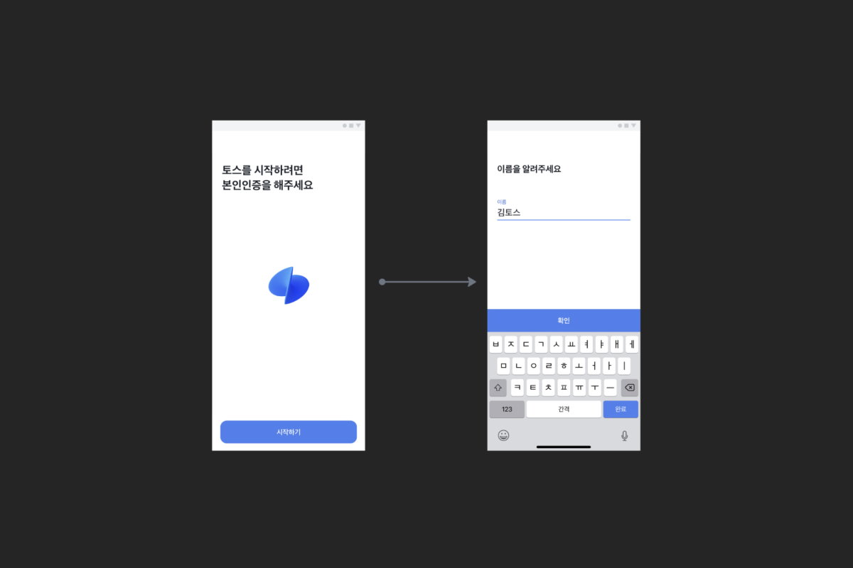
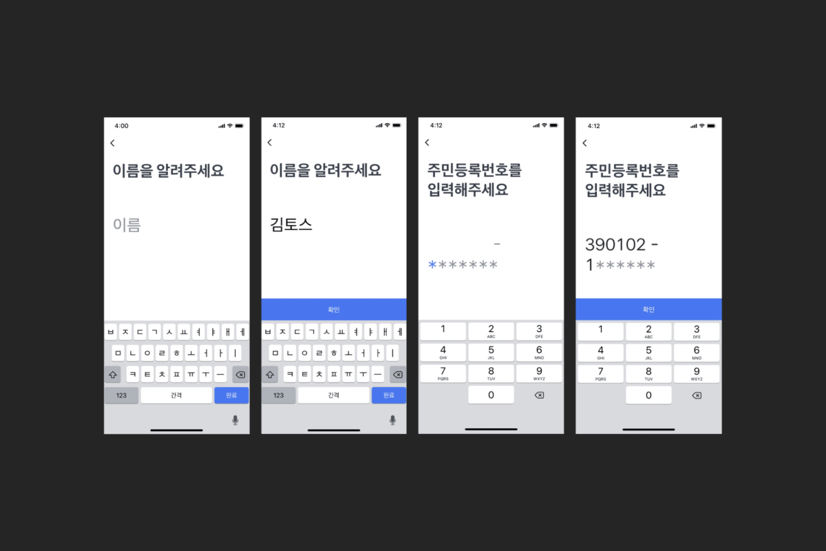
We talked about it from the very first. After many experiments, the current screen was very different from the general app usability. As soon as you entered the first screen, we immediately asked for their name, and since the input field was activated, the keyboard came up, so the text at the top which said “To start a Toss” was probably hard to see.
Q: Right. Since the keyboard comes up right away, I focus on ‘I have to type’ rather than what I should do now.
Yes. We thought that users may not know filling their name is part of the registration process. So we hypothesized that if we clearly explain that these process are required for registration, the dropout rate will be reduced.
So we designed the very first screen so that users can take familiar actions through 2 clear processes: Log-in and Sign-up. And familiar UI can reduce cognitive costs. But we were not able to solve problems again. If we know the reason, we can improve it according to that reason, but we don’t know the reason why, and even data can’t tell us the reason why users don’t complete the sign-up process. So we decided to meet users and find out the cause.
In a User Text(UT) done by other team, we heard that senior users were very reluctant to the word social security number in the process of filling their personal information. So we created prototype of replacing social security number with date of birth and proceed UT for senior users who had never used Toss before.
Last trials
Q: You did directly pre-verify with UT rather than A/B test instead?
Yes. It because we needed qualitative data rather than quantitive one. And The pass rate for social security number step was already high itself. But it was completely wrong hypothesis. It didn’t matter that we asked for social security number or date of birth at all.
However, there was a clear difference depending on the OS. While iOS users said they had no objection to the registration process and actually liked it because it was convenient, Android users were very sensitive to even filling their name.
Q: What was the reason?
Depending on the OS, user characteristics may differ, but the very first screen provided was different due to the permission for each OS. iOS user get enough context of requiring identity verification but Android user get immediately a screen asking for their name without any explaining context and reason. So, we hypothesized that if enough context was explained, leaving rate would be reduced and we did the experiment again.
It wasn't a big difference, but the dropout rate eventually decreased. By explaining to users the context of why this process is necessary, the sign-up completion rate increases. In the end, it was more important that there’s no need for user to understand than make them understand and tell them properly the reason why these are required.